Kraft Kidz — Good Design, Bad Idea
Brand Identity & Packaging Design | Senior Design School Project
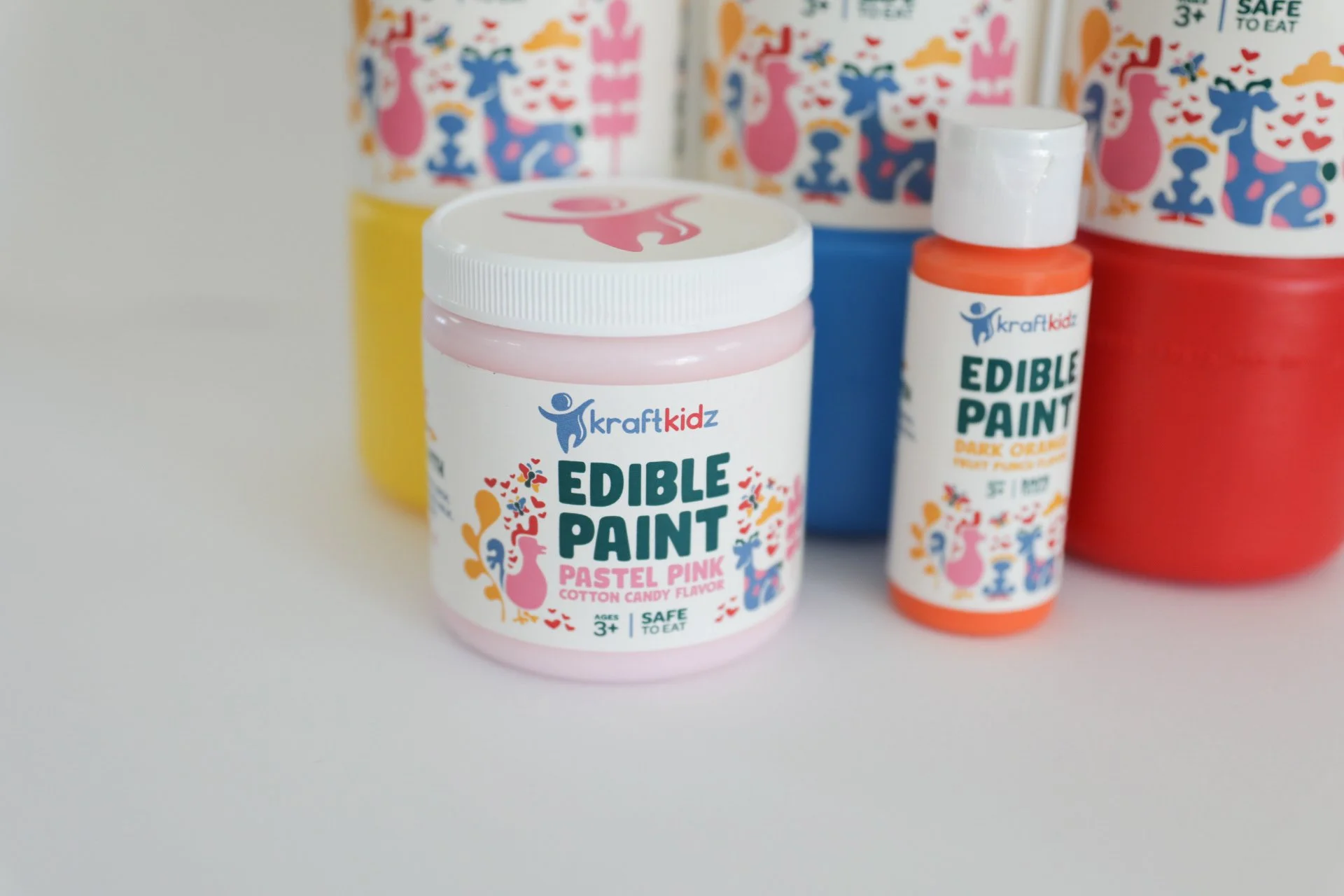
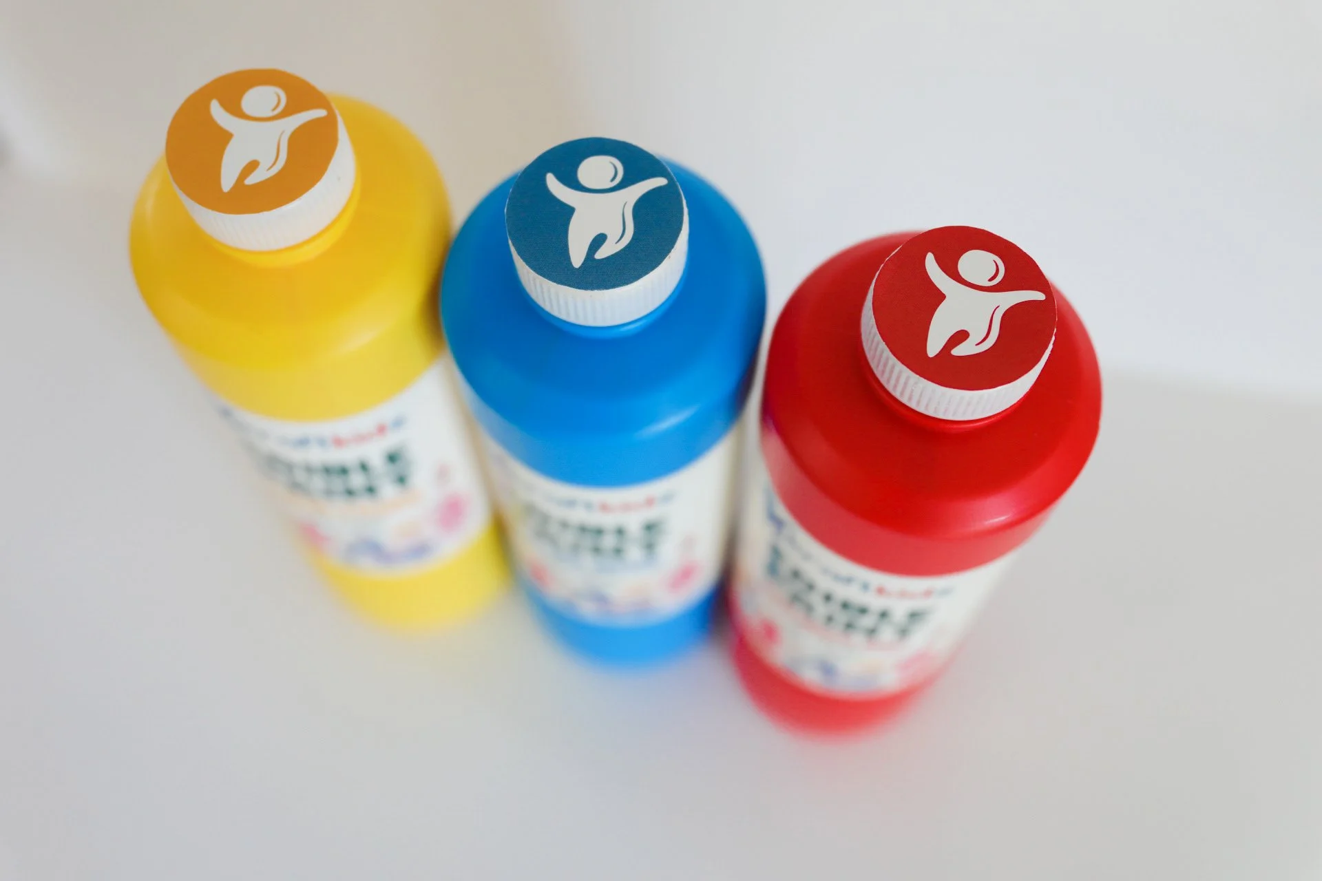
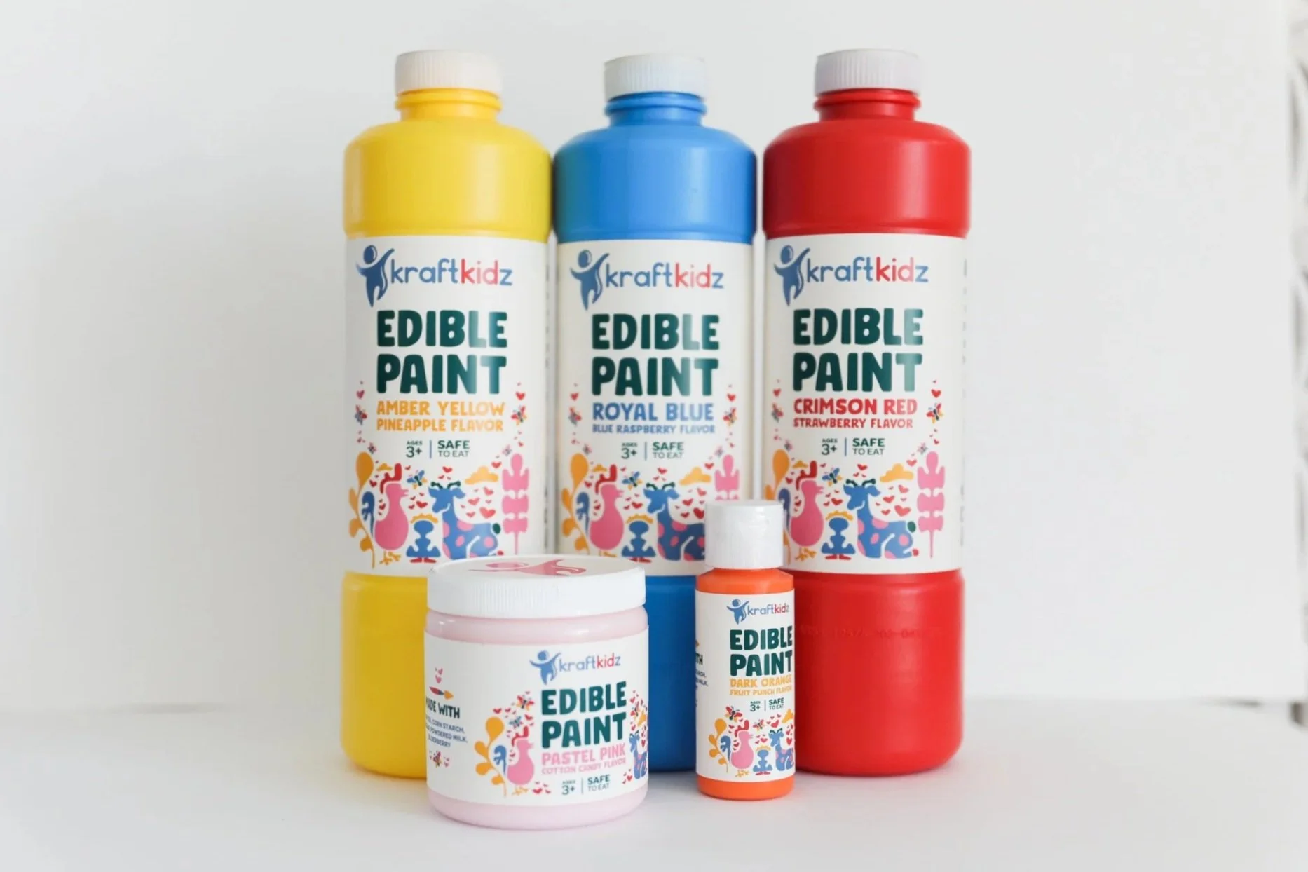
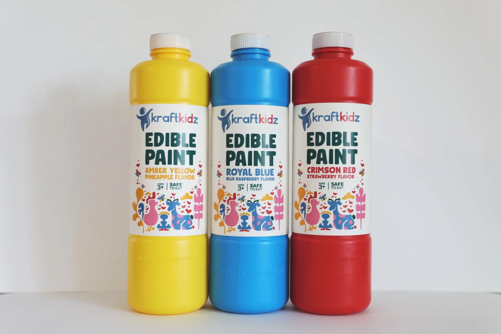
As part of a packaging design course during my senior year of design school, I was challenged to create a complete brand identity and packaging system built around a “bad idea” with exceptionally good design. I chose to develop Kraft Kidz, a playful brand of edible paint for children.
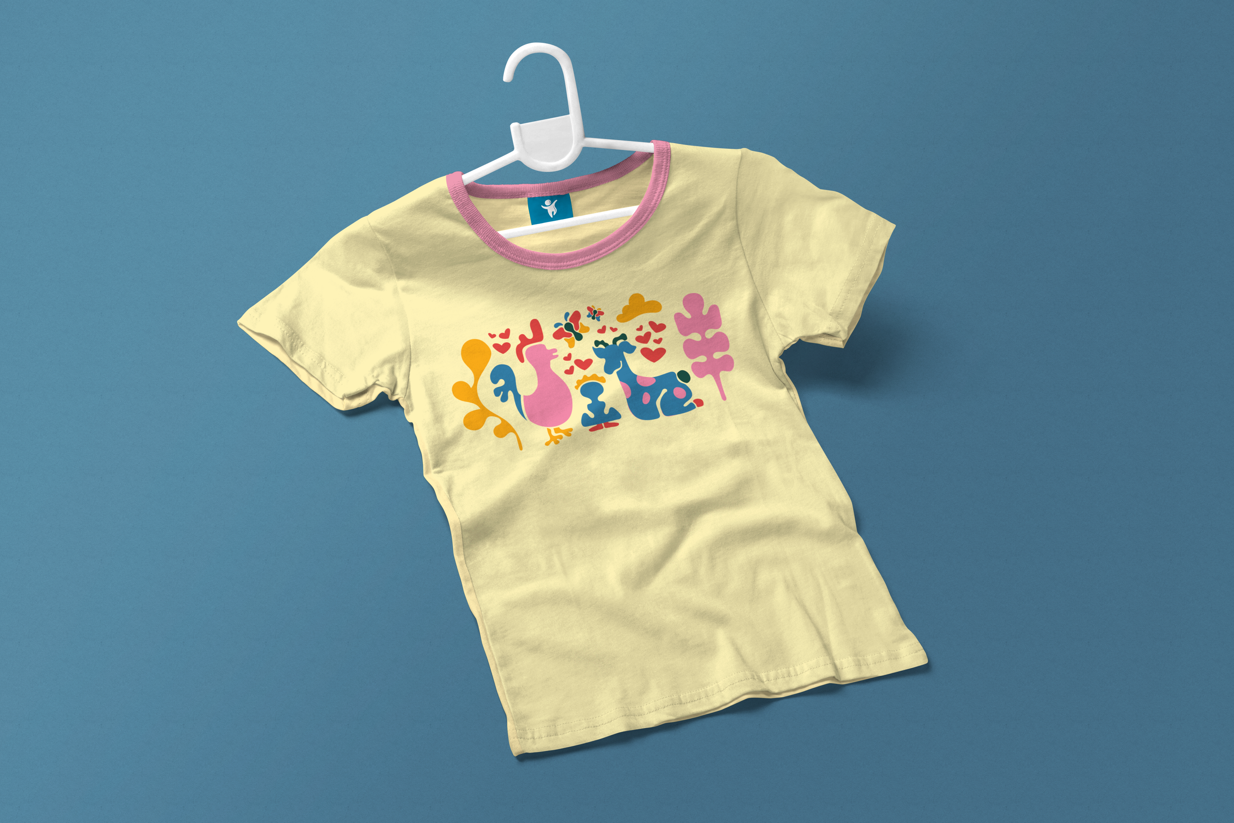
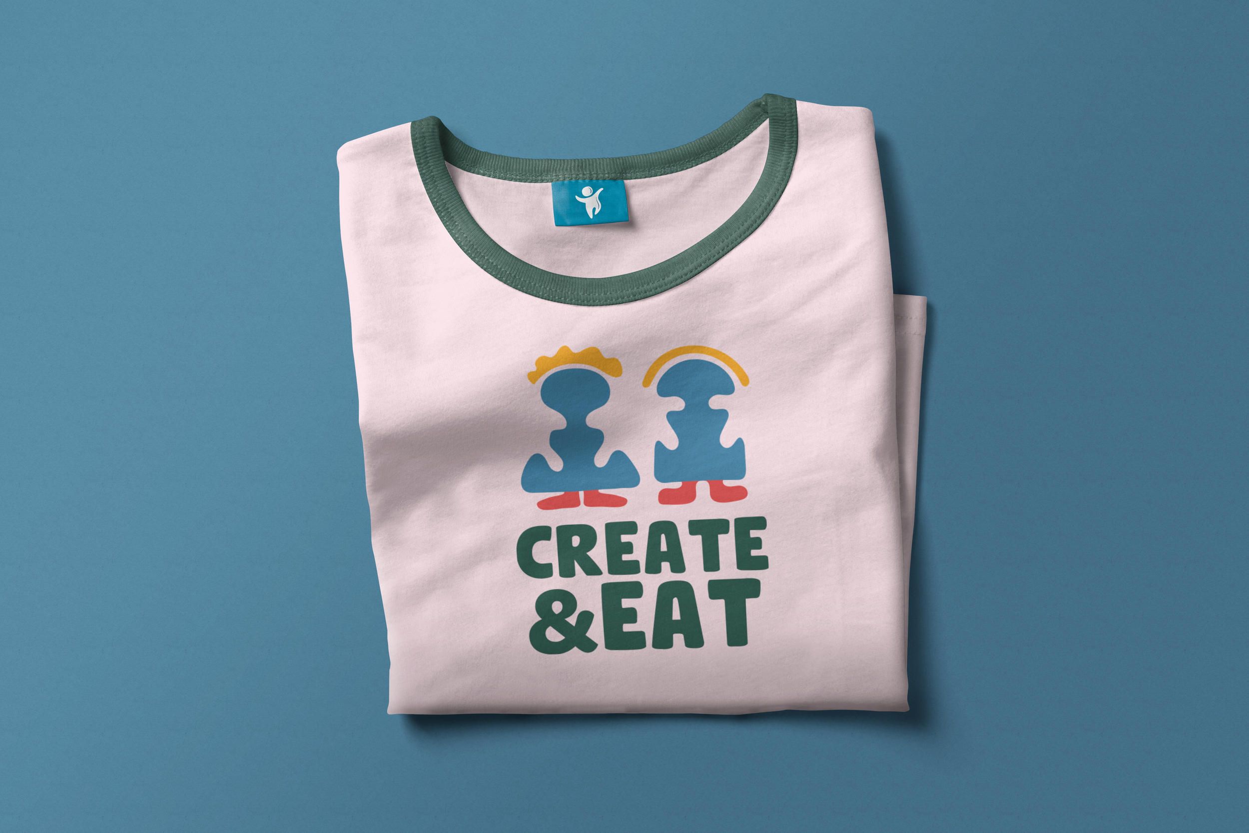
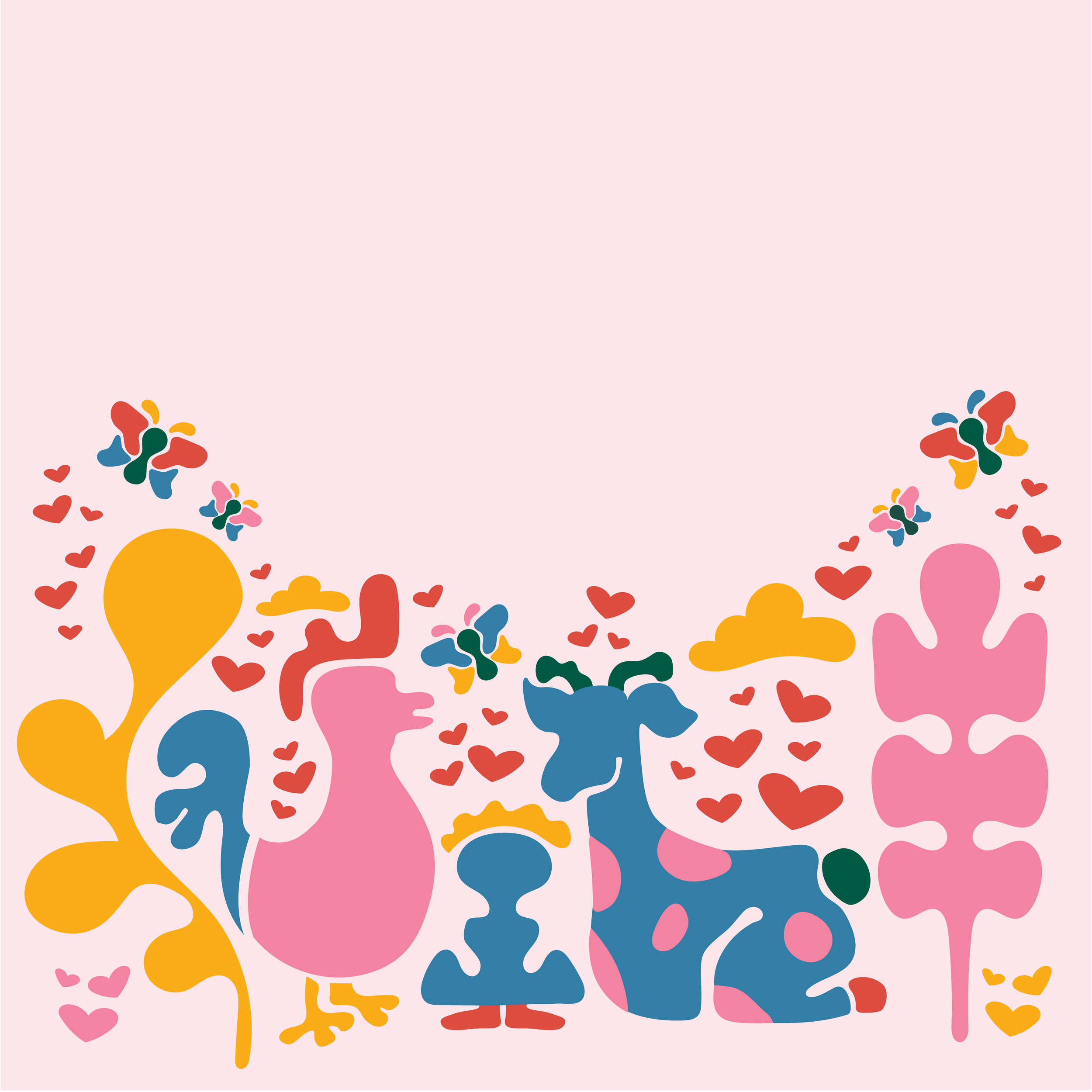
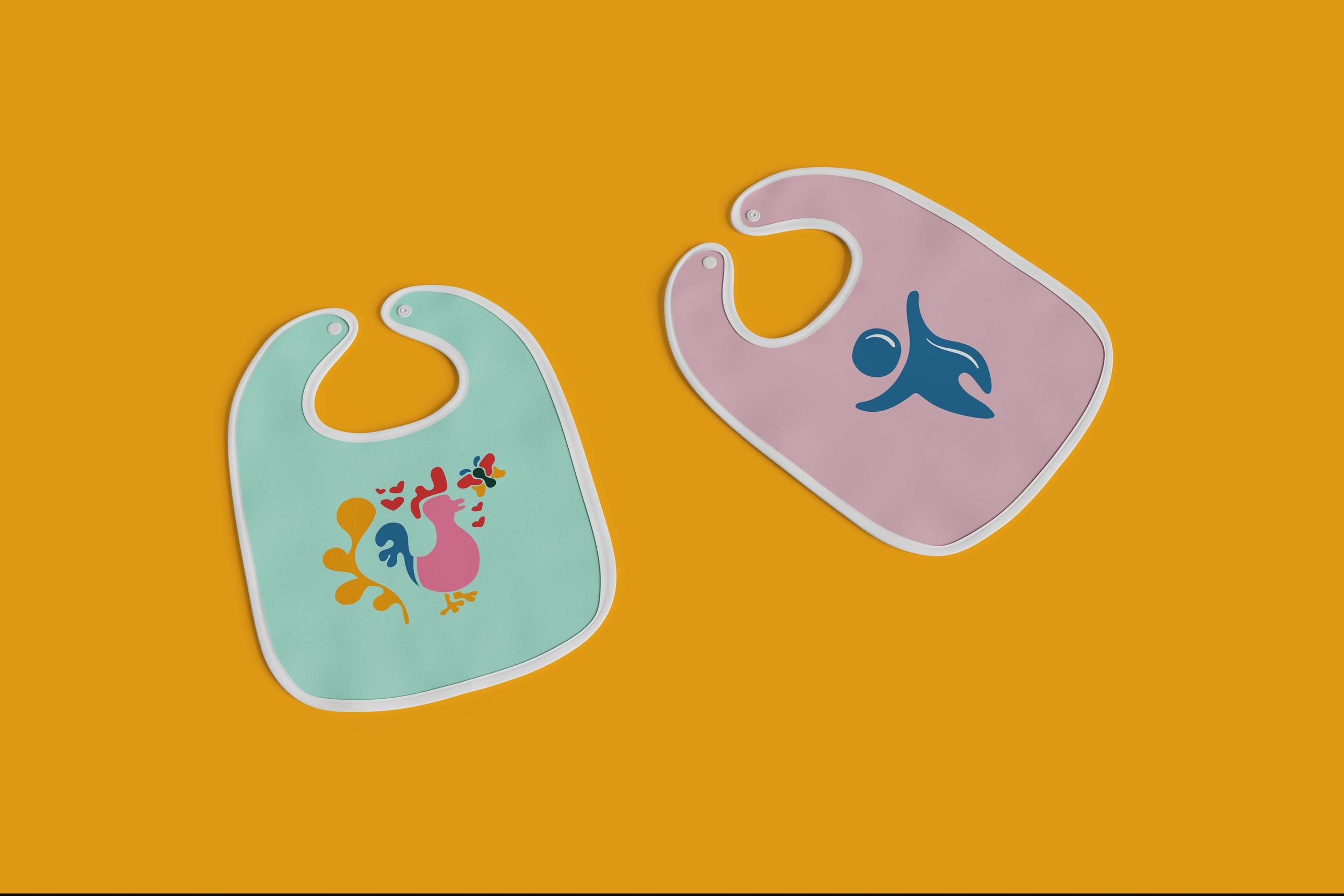
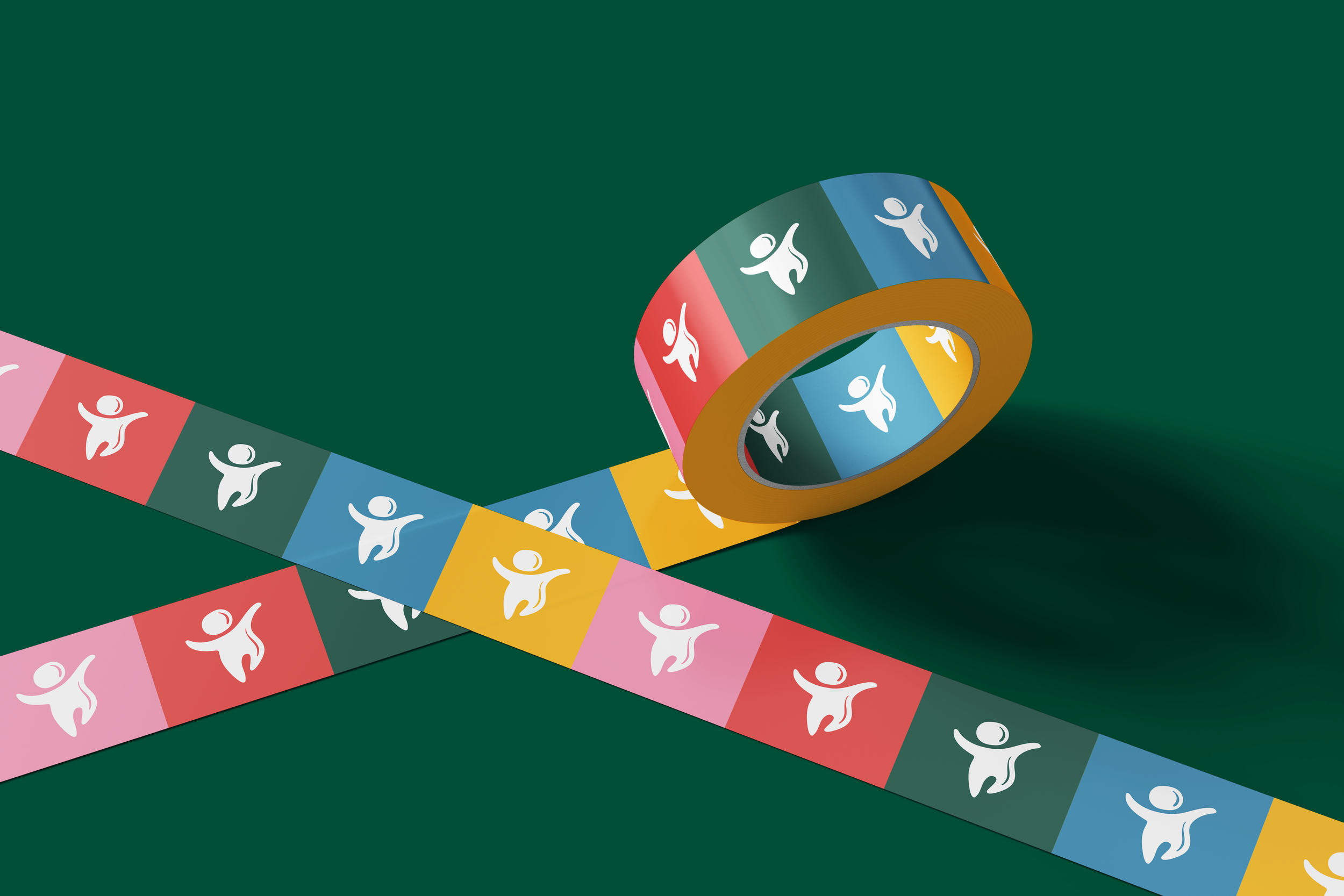
The concept gave me an opportunity to explore how strong branding and packaging can make even a questionable product idea feel fun, approachable, and marketable. I hand-illustrated the visual elements and developed a colorful, playful identity designed to capture the energy and imagination of a kids’ brand.
From the logo and illustrations to the packaging system, every element was created to feel cohesive and intentionally appealing. The end result was a brand that almost makes you forget to ask the obvious question: why would anyone want to eat paint?