The Challenge
The project required finding a visual balance between two seemingly opposing qualities: playful and serious. The new identity needed to appeal to a creative, technology-focused youth audience while still feeling credible and connected to the larger URJ brand.
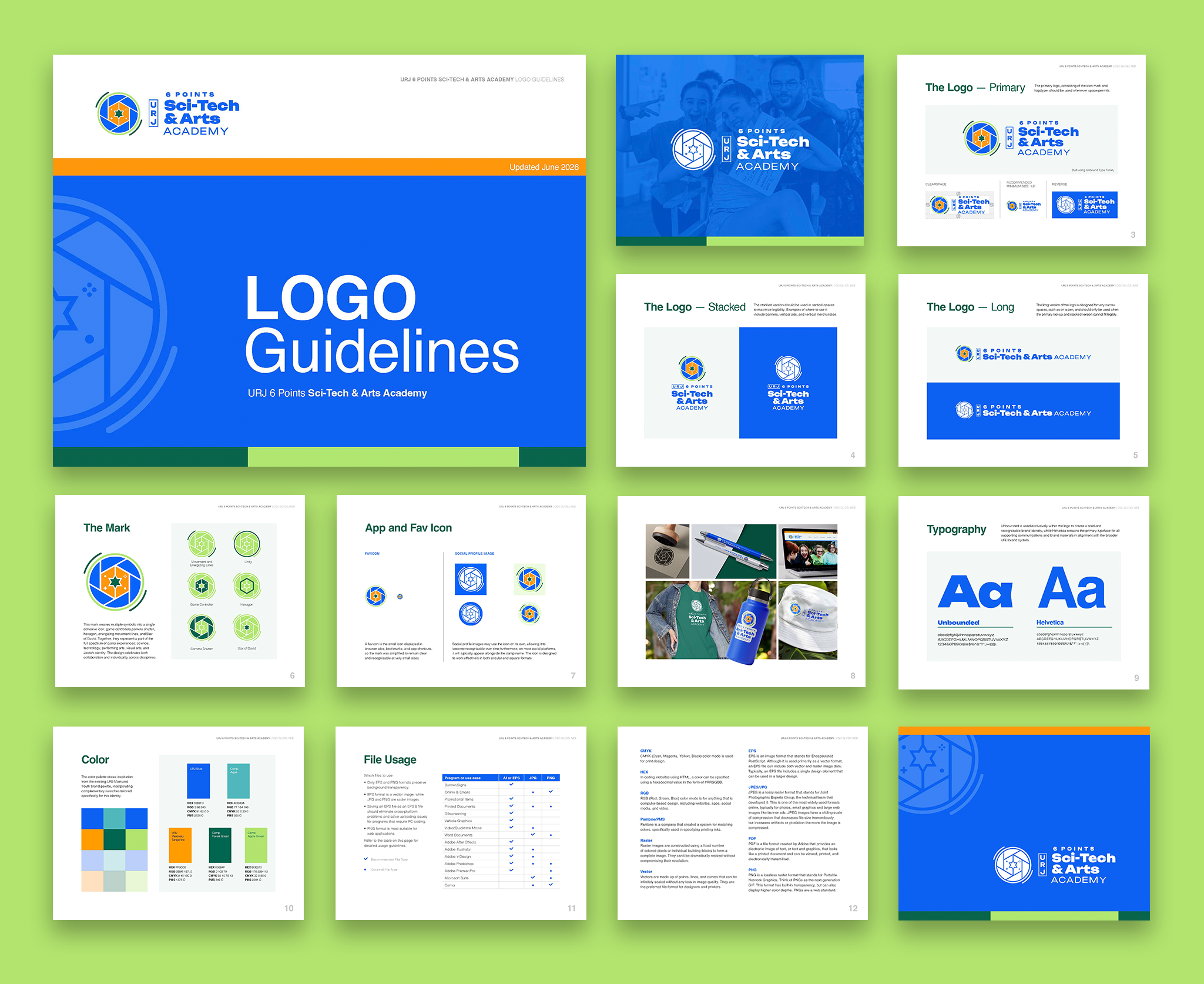
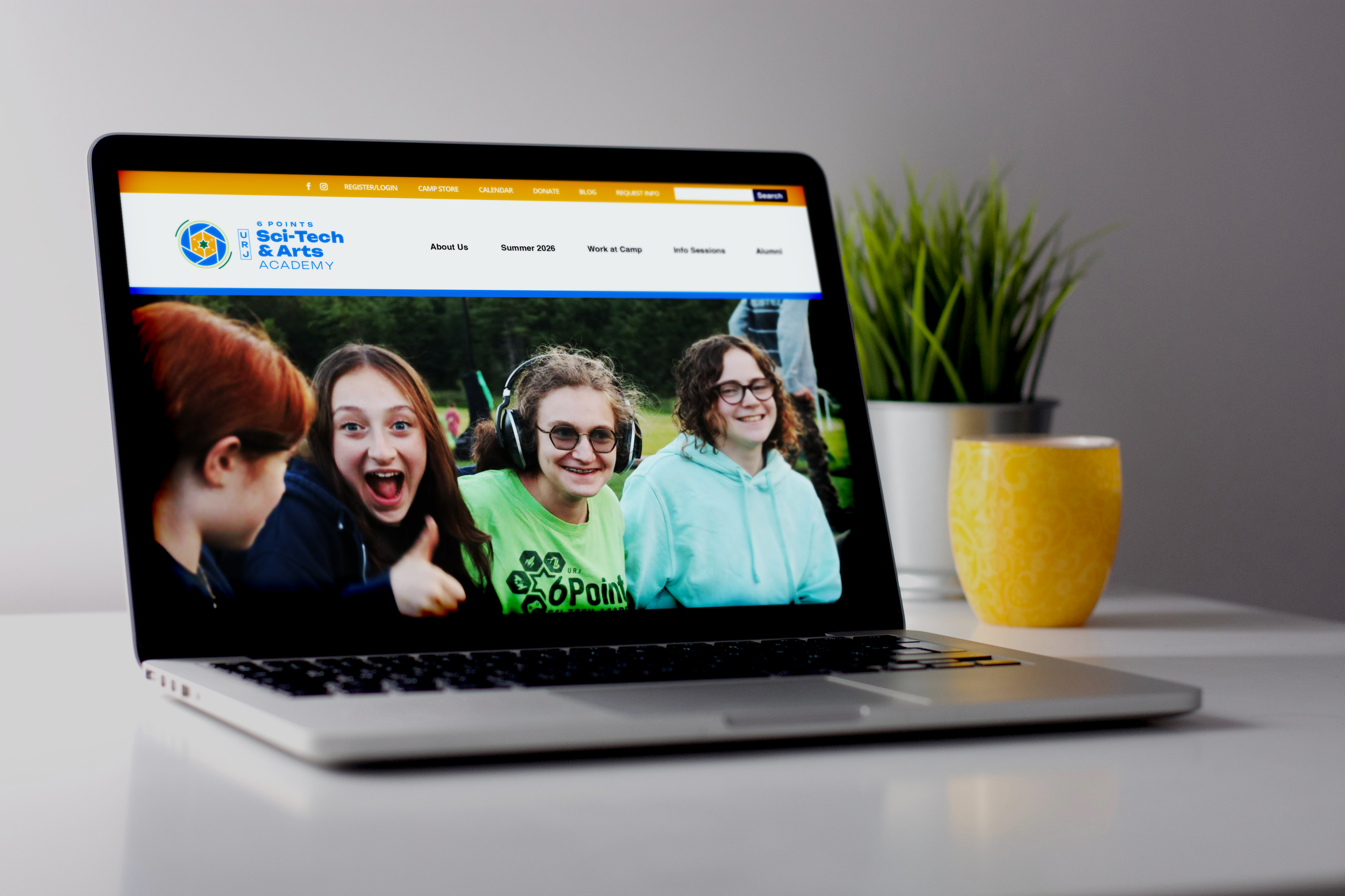
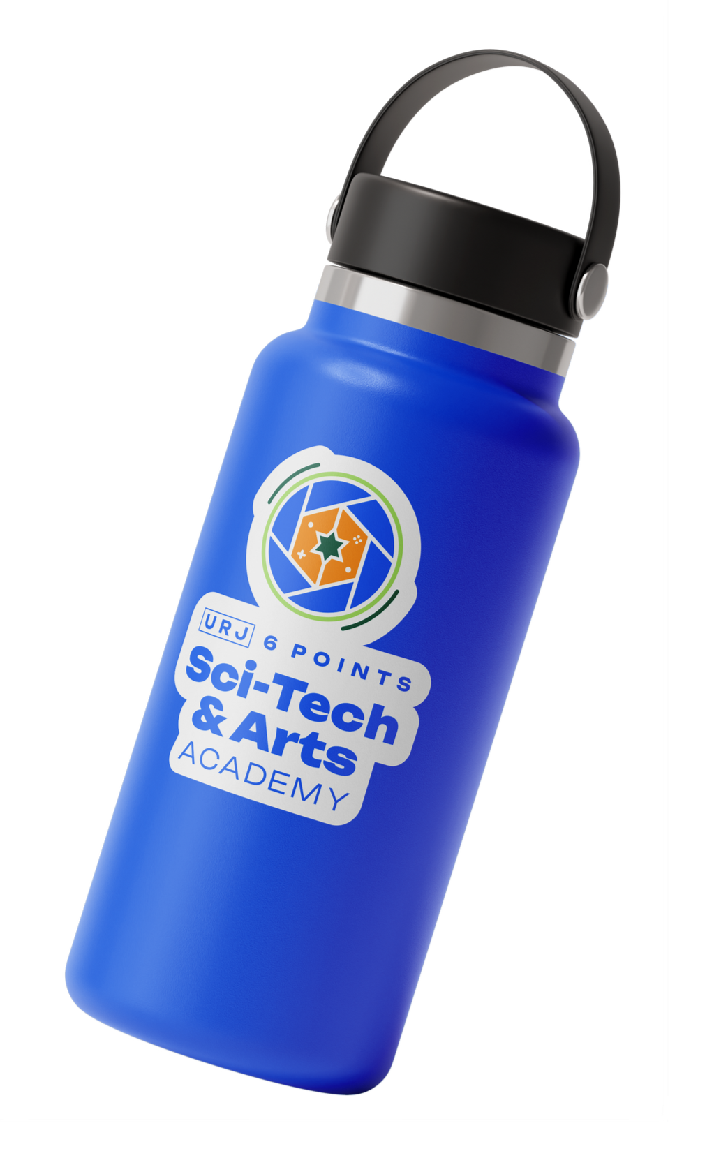
The brief called for a modern identity that could work across a wide range of applications, from T-shirts and other camp merchandise to large-format banners and digital platforms. The client also wanted to retain the spirit of the camps’ existing iconography without carrying over the visual complexity of the original logos.
Design Approach
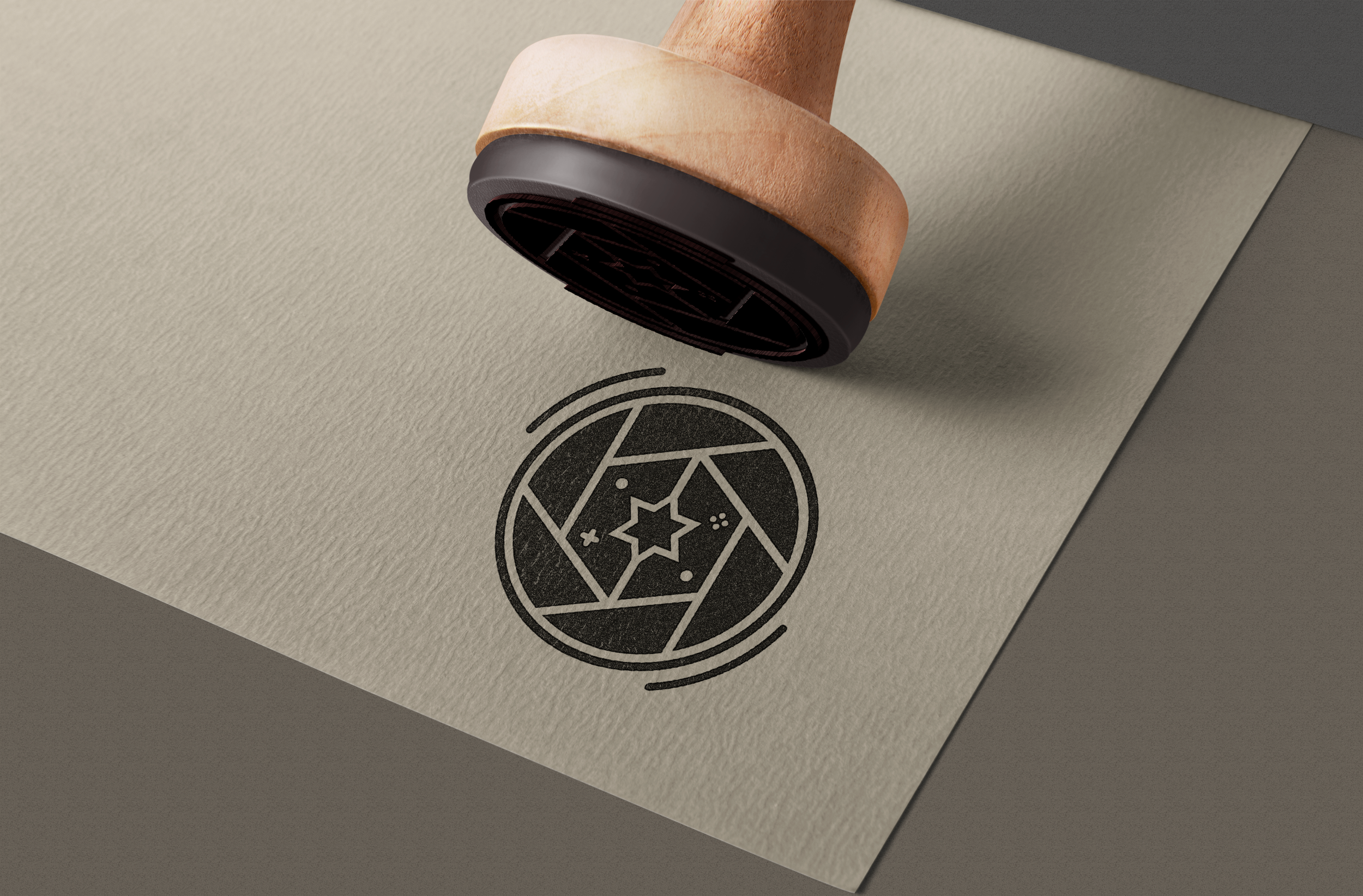
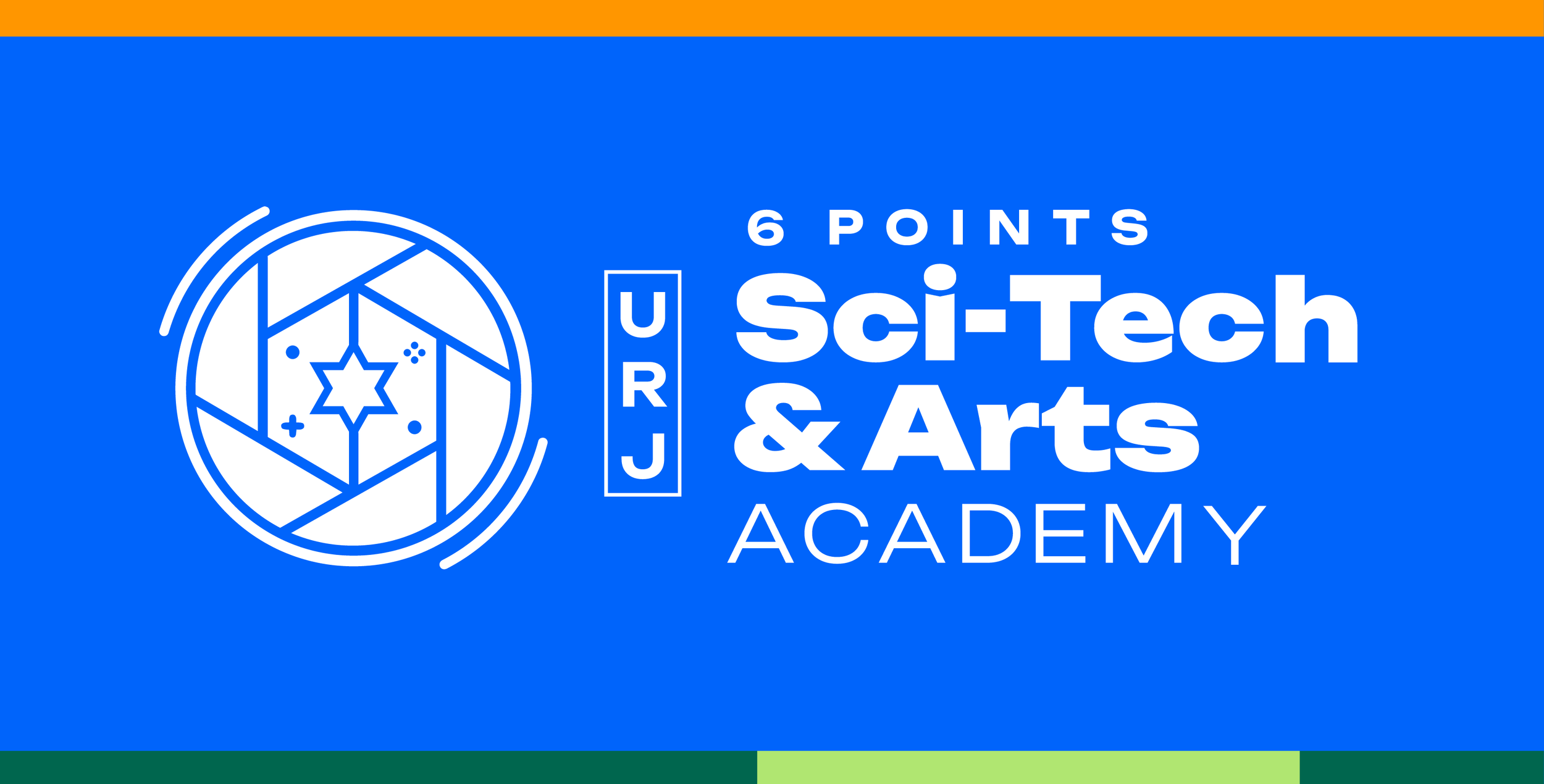
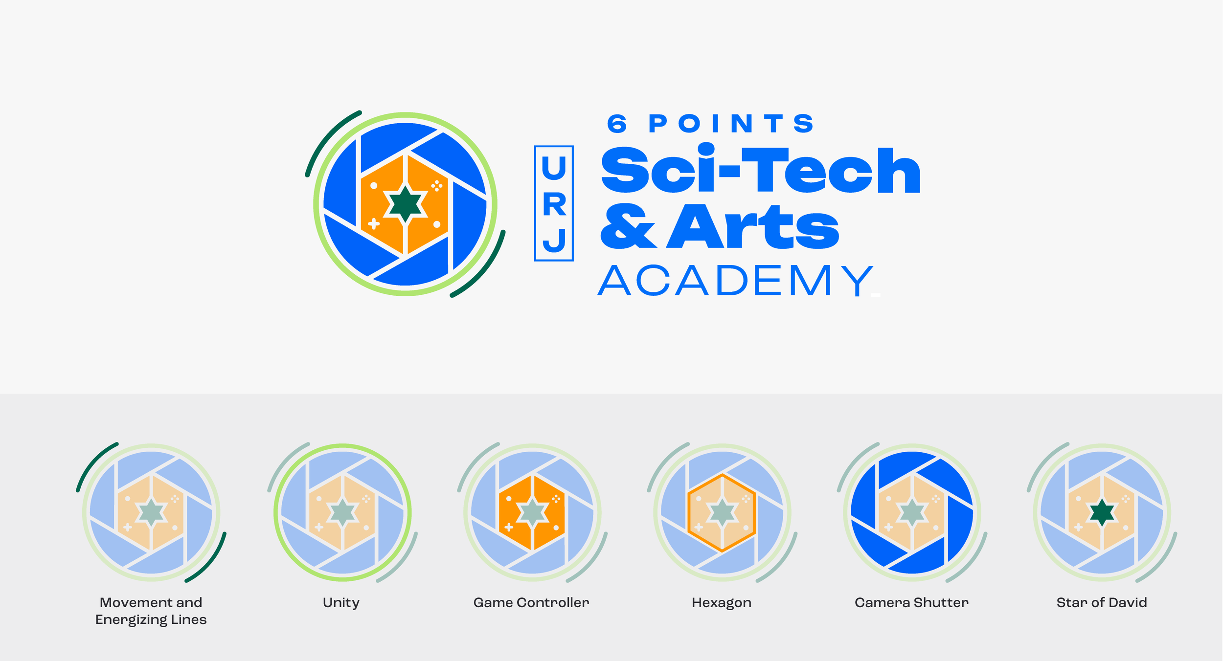
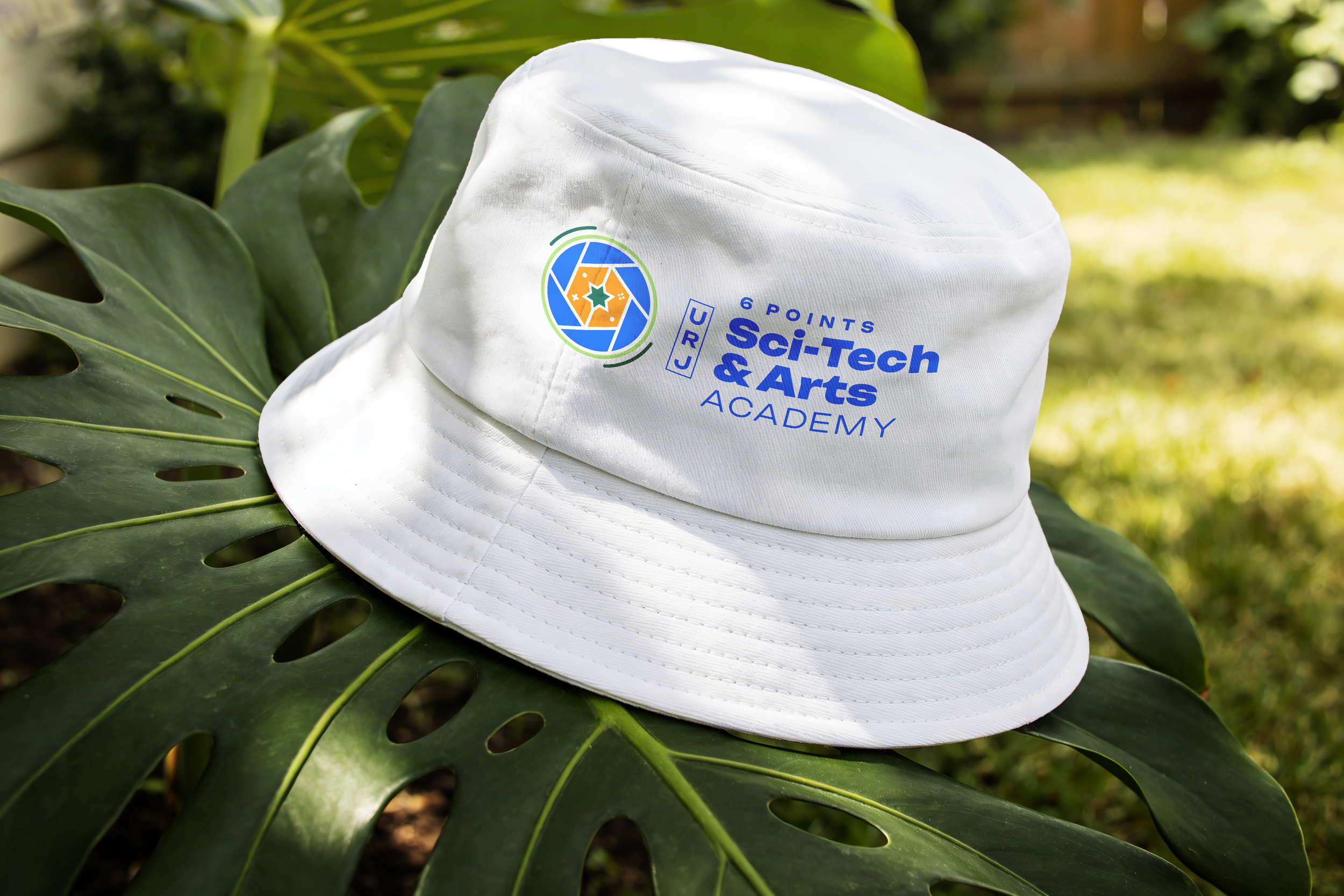
The new mark was designed as a visual intersection of Sci-Tech, the arts, and Jewish identity, bringing together several recognizable elements into one cohesive symbol.
I explored the existing visual language of both camps and identified individual forms that could be reinterpreted within a single mark. The segmented circular form references a camera shutter, connecting the identity to photography and the visual arts, while the hexagonal geometry and game controller references bring in the technology, experimentation, and playful spirit of Sci-Tech. At the center, a Star of David provides a clear connection to the camp’s Jewish identity.
The outer circular ring represents unity, bringing the two previously separate camps together within one shared identity. The surrounding curved lines add a sense of movement and creative energy, reflecting the dynamic and collaborative spirit of the camp.
Together, these elements create a modern, flexible mark that brings together creativity, technology, Jewish identity, and unity in a single visual language.
Overview
The Union for Reform Judaism (URJ) was bringing its Arts Camp and Sci-Tech Camp together under one unified camp identity. The challenge was to create a new logo that honored the visual language and personality of both existing programs while establishing a cohesive identity for the newly merged camp.
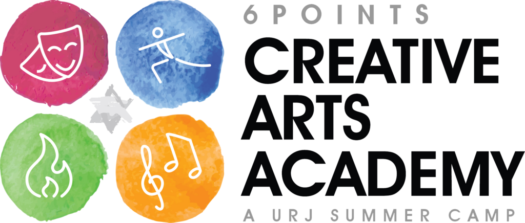
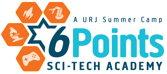
The existing camp logos each had their own distinctive iconography, but the visual complexity made them difficult to reproduce consistently across different applications. The new identity needed to feel modern, memorable, and versatile while maintaining a connection to the two programs’ existing brands.
Two original camp logos to be combined